Pabst Blue Ribbon × Jason Universe
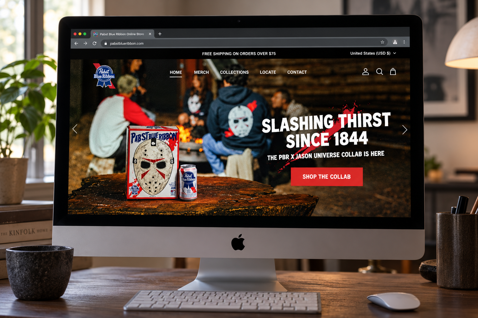
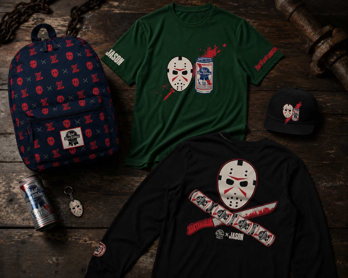
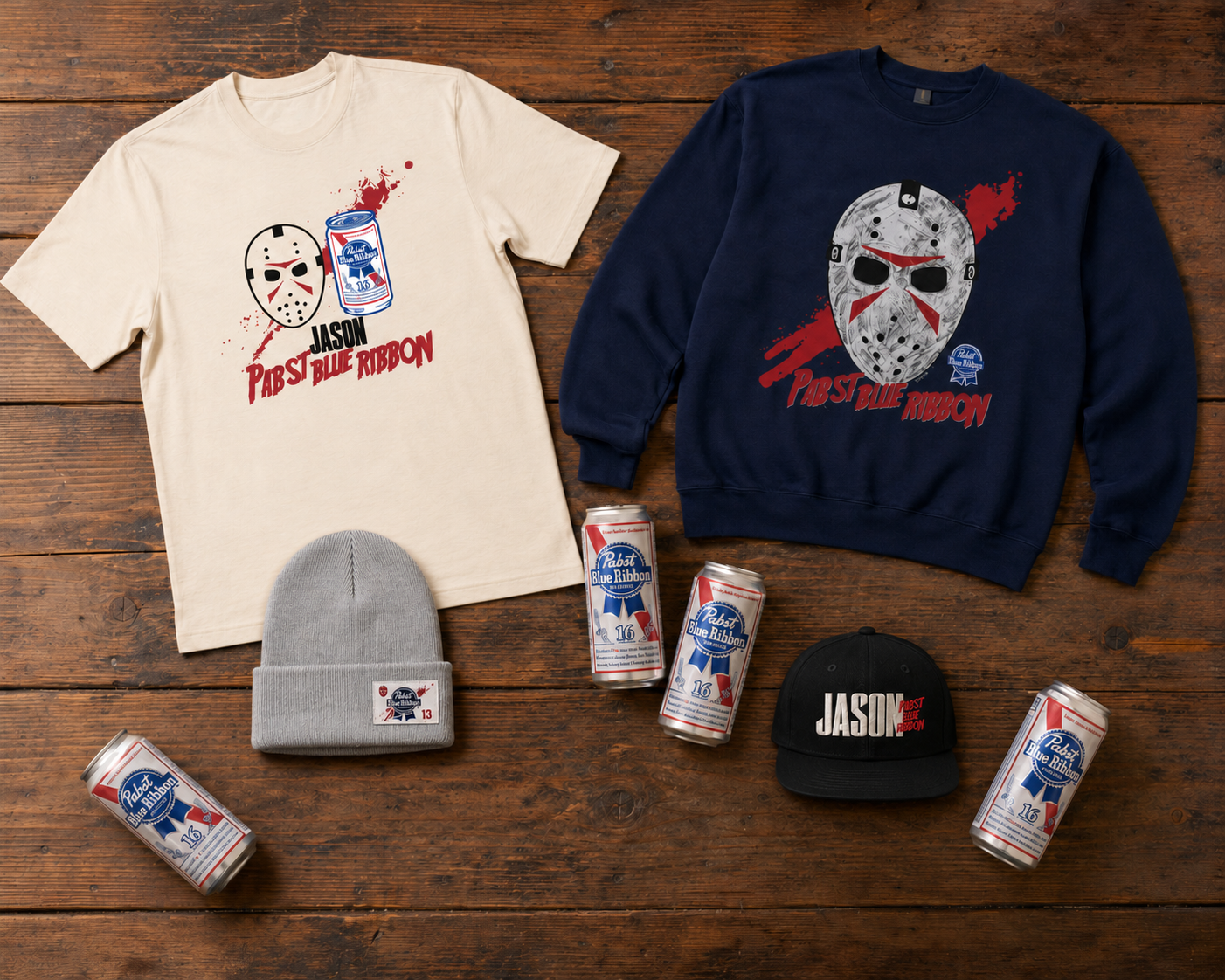
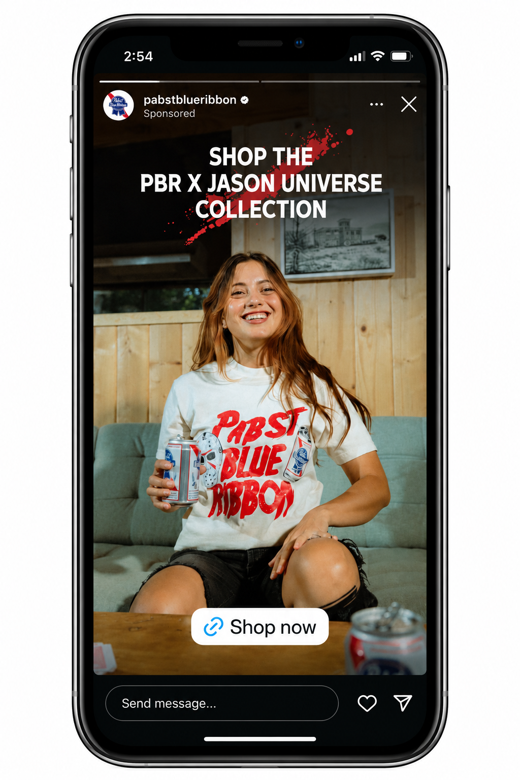
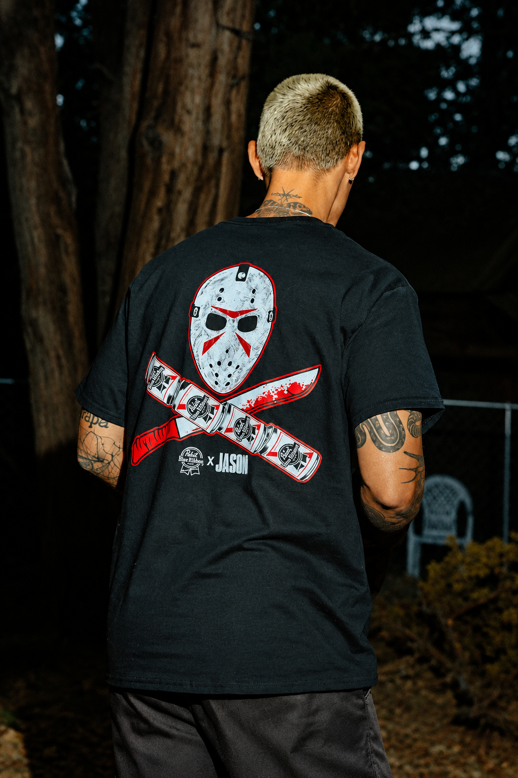
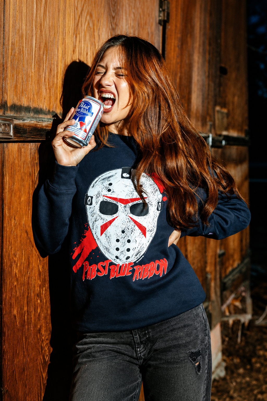
Bringing together the familiar identity of Pabst Blue Ribbon and the unmistakable presence of Jason Universe, this collaboration was developed as a complete collection of apparel, accessories, and collectible goods for the Halloween season. The goal was to create a well rounded line that connected both brands through a cohesive design point of view, balancing Pabst’s heritage and independent spirit with the horror imagery and cult appeal associated with Jason.
As Director of Product Design, I led the product direction and assortment development, working closely with a talented graphic design partner and a great production team to bring the collection to life. It was a collaborative effort that brought together creative vision, graphic storytelling, and production expertise. My focus was on how the individual pieces worked together, building a collection with enough variety to feel substantial while maintaining a recognizable identity across every category.
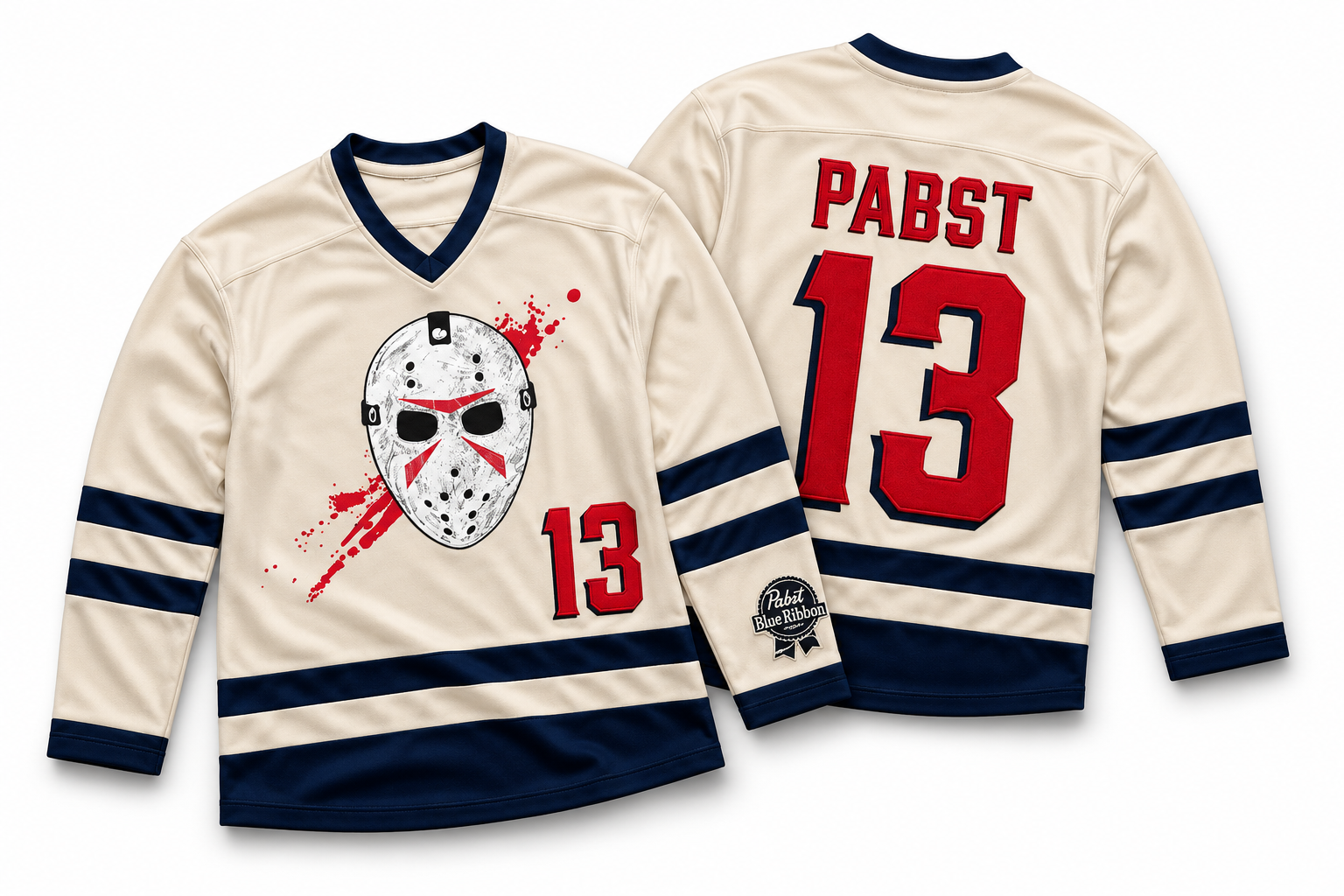
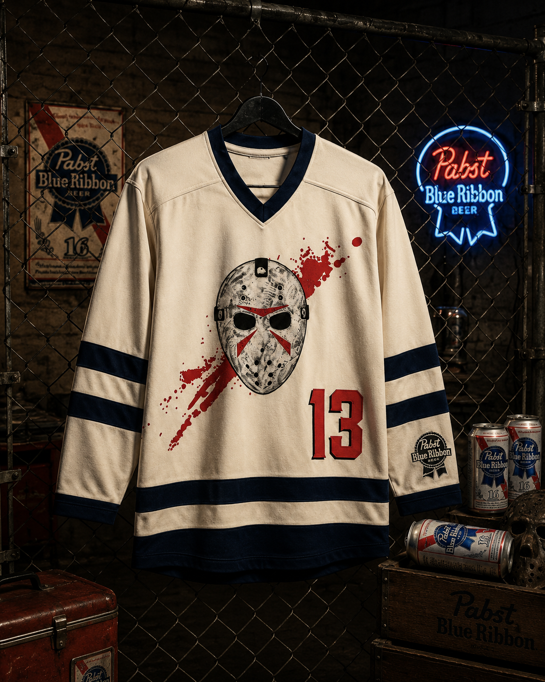
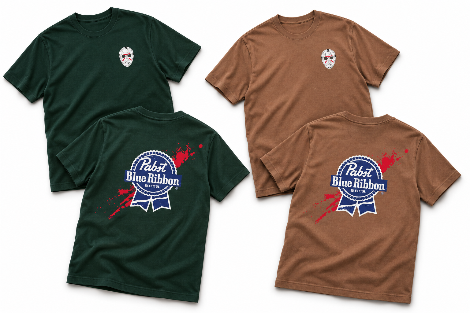
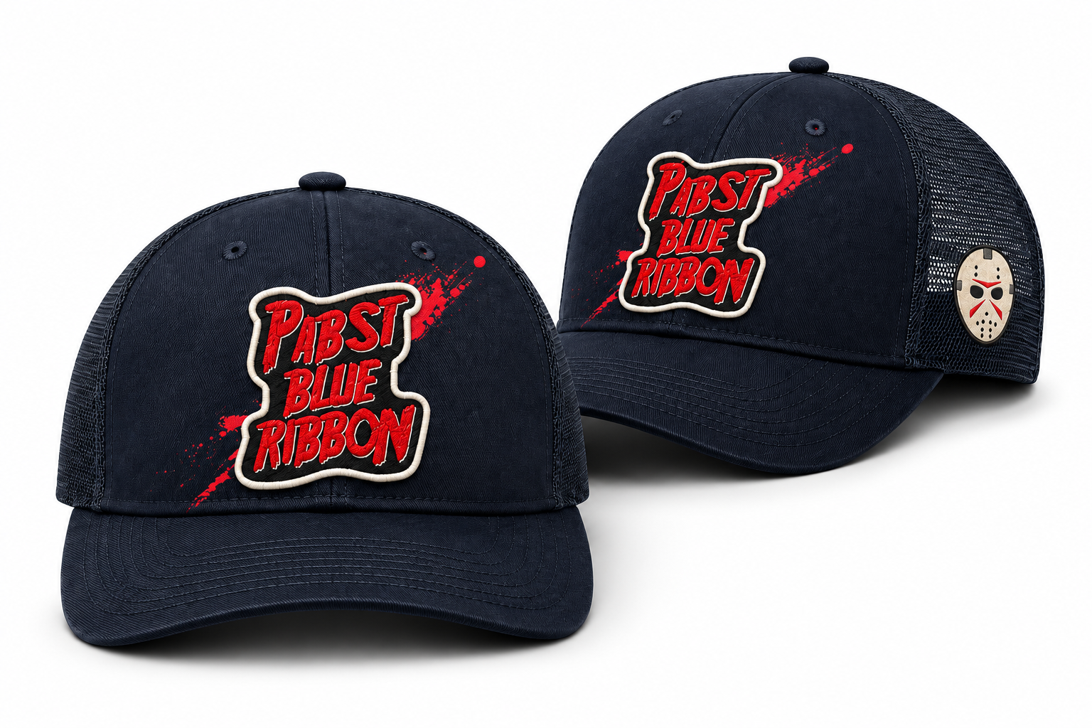
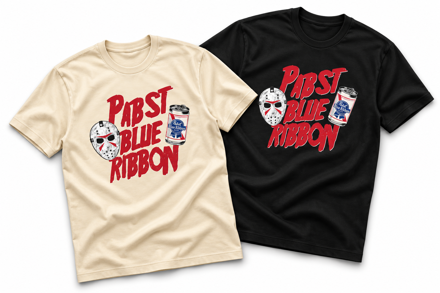
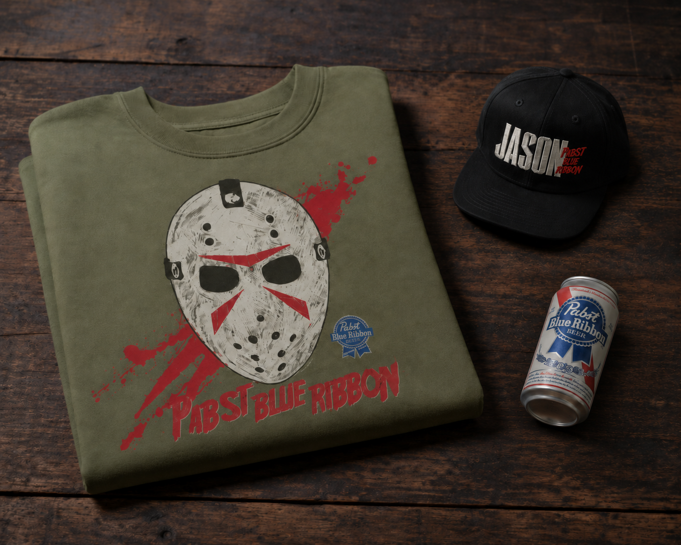
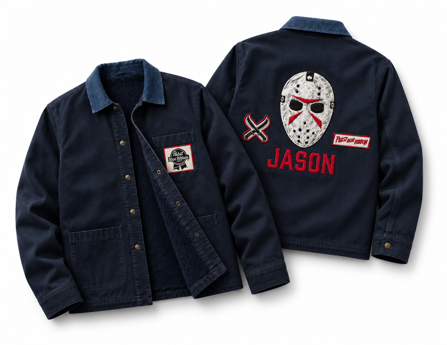
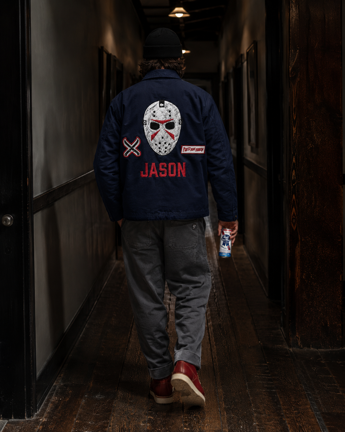
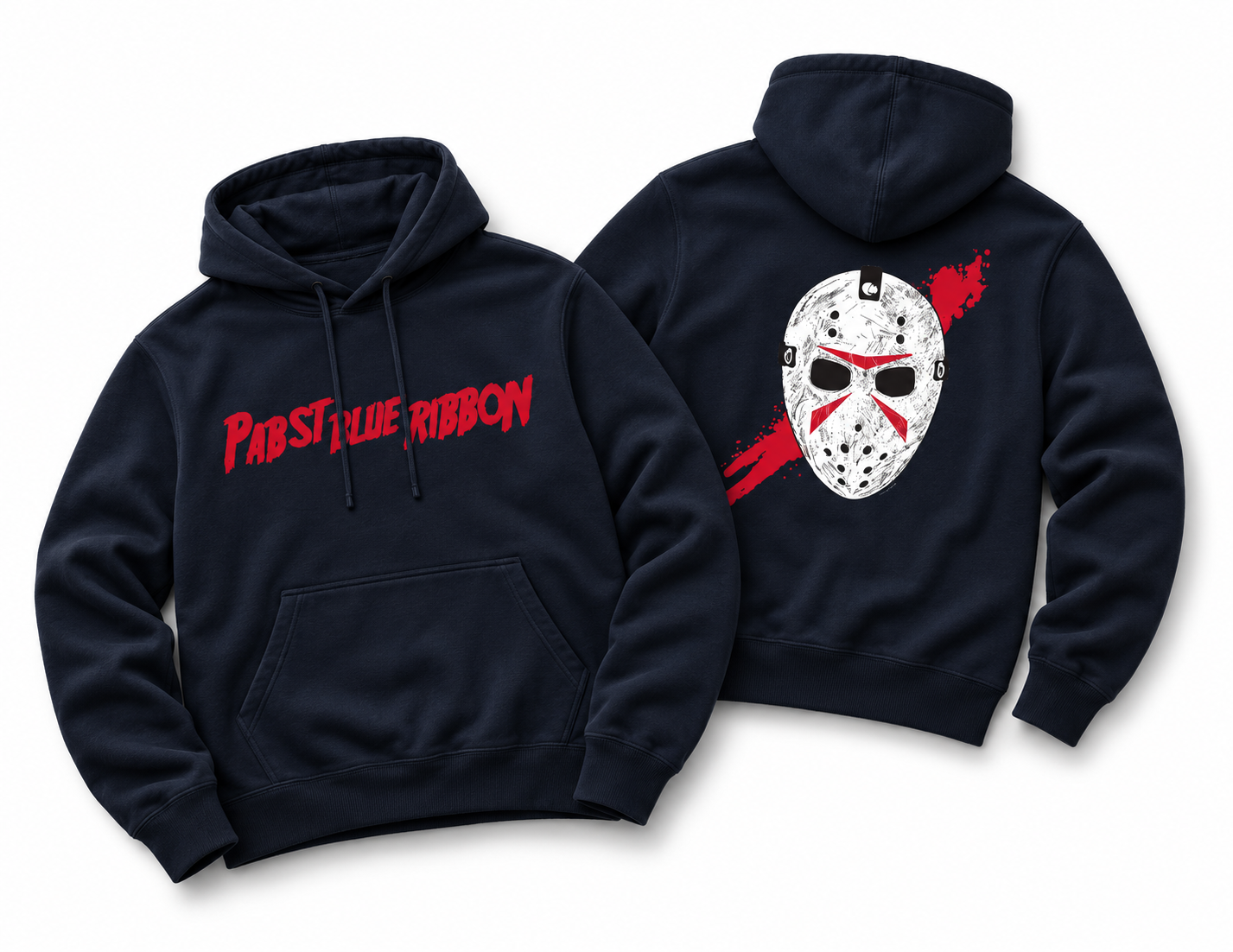
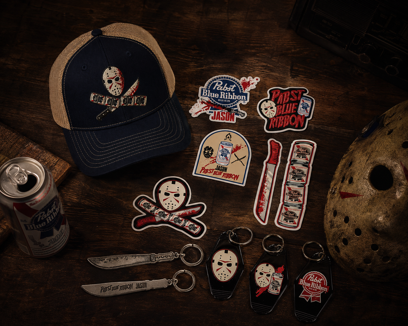
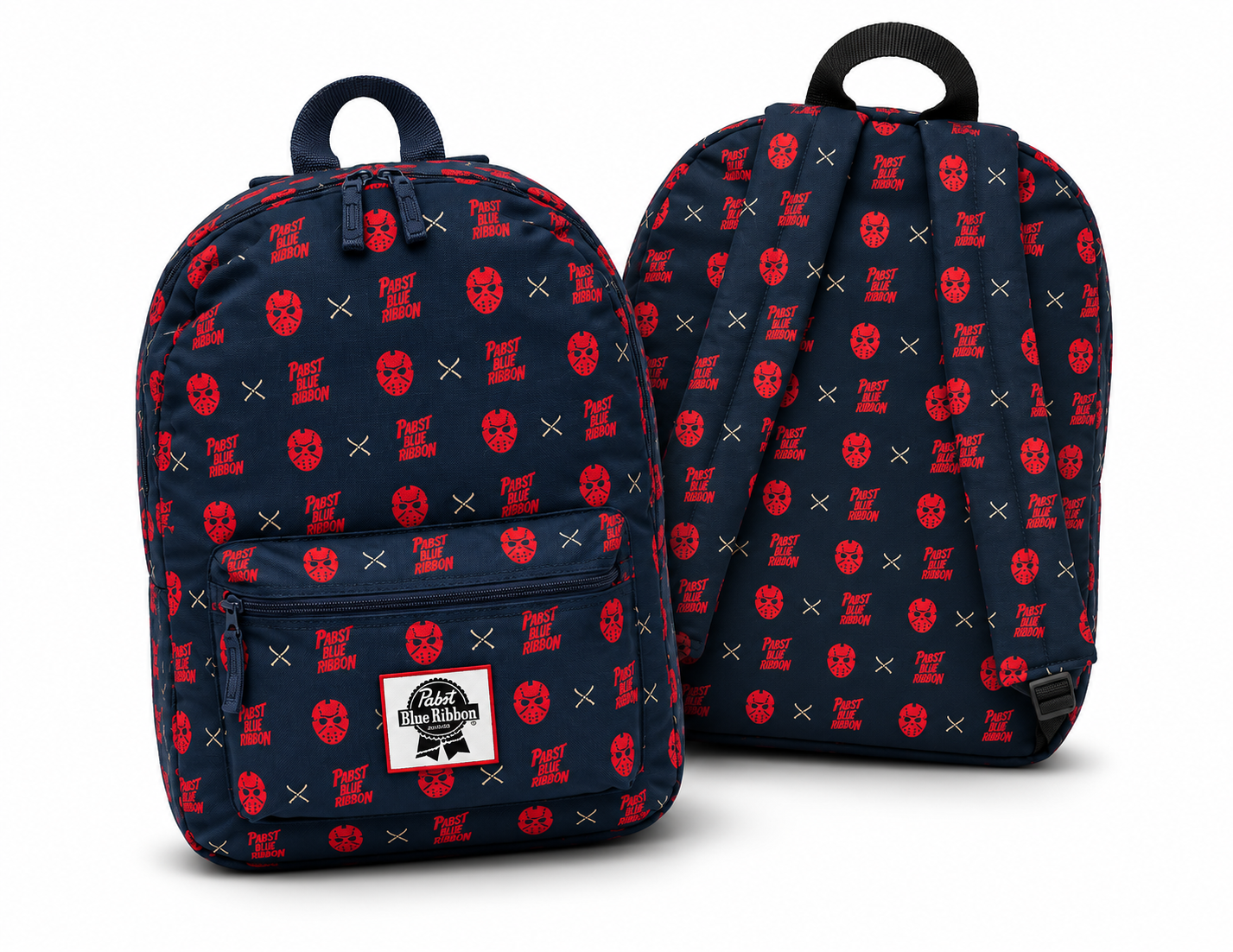
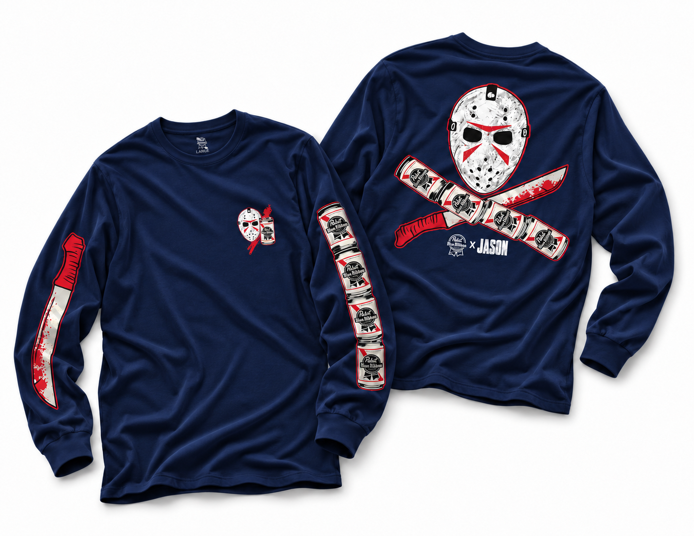
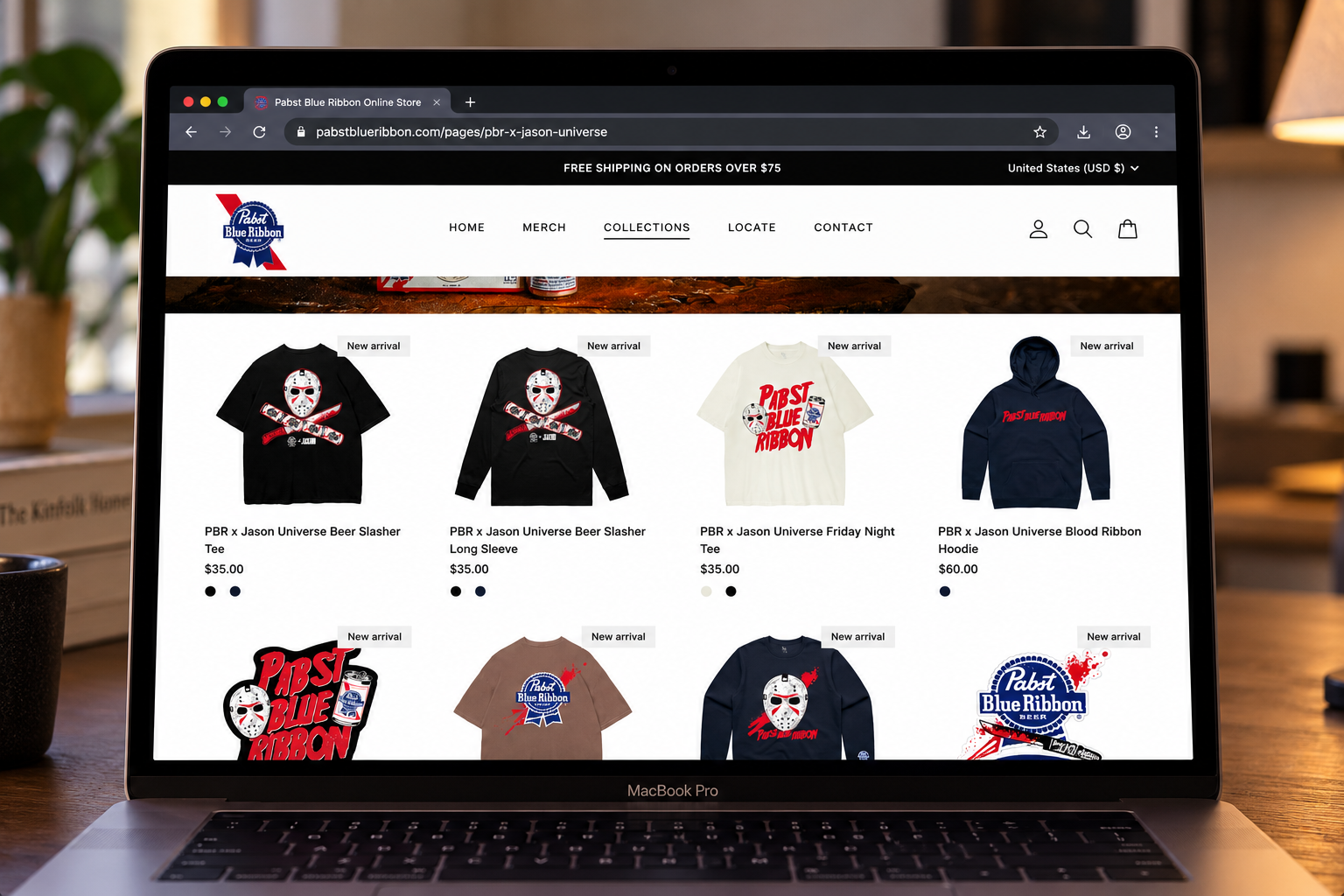
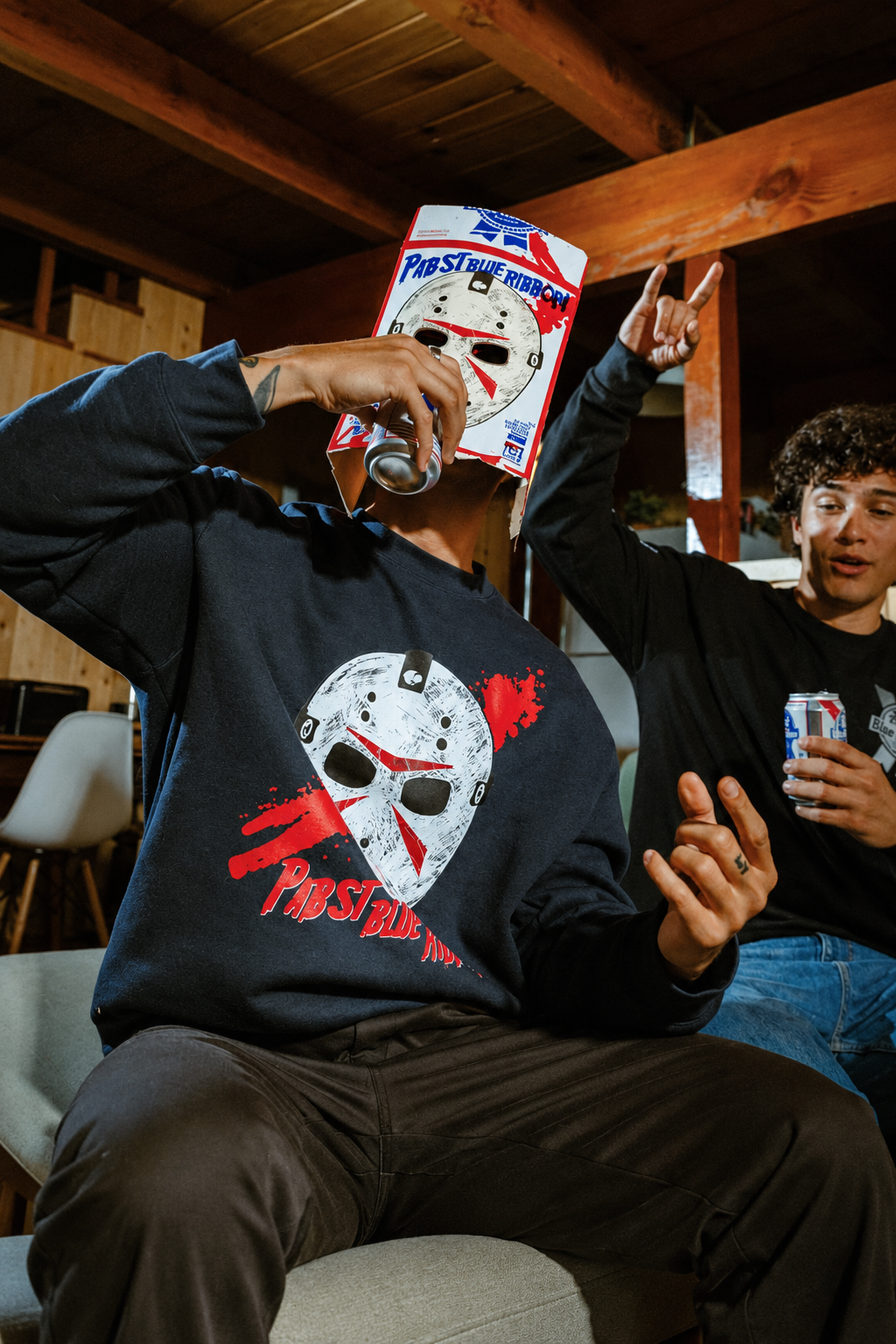
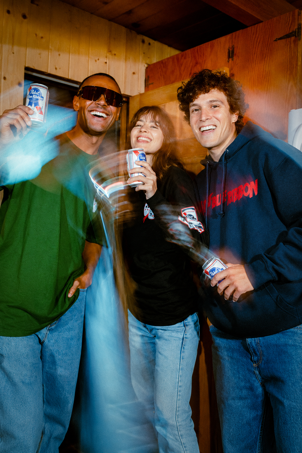
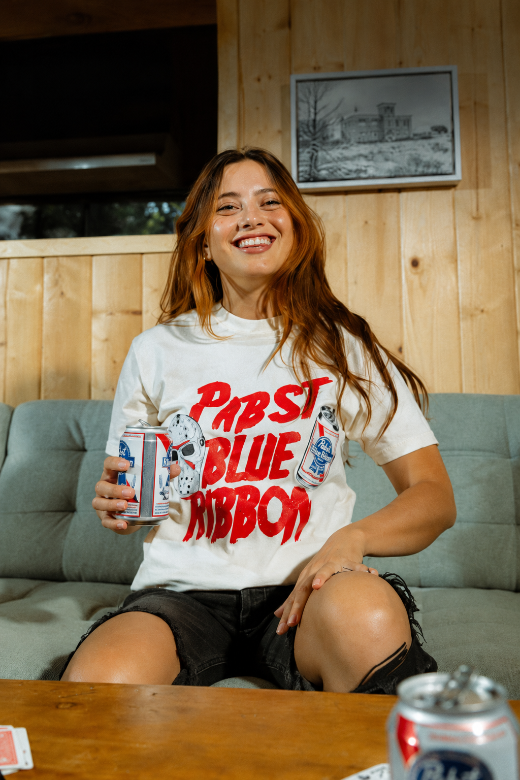
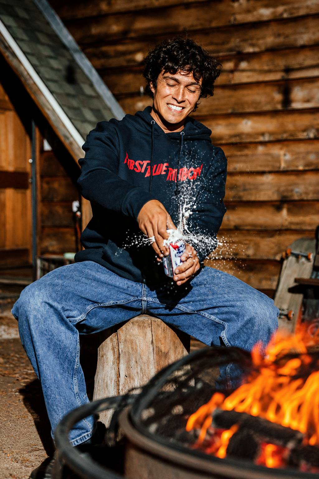
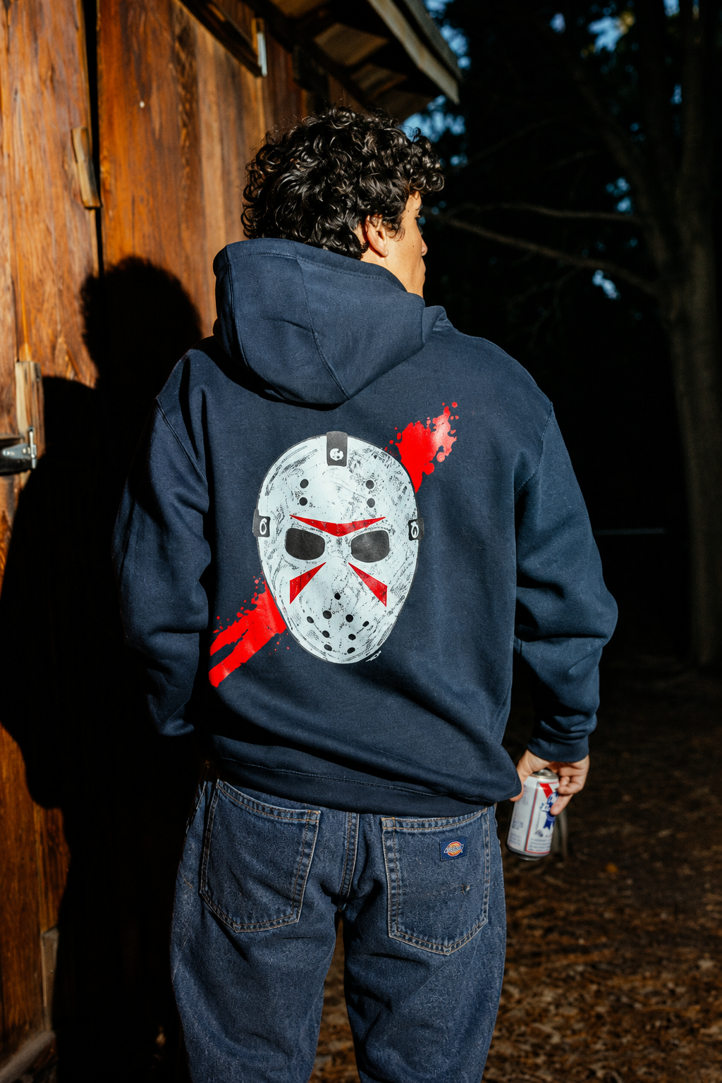
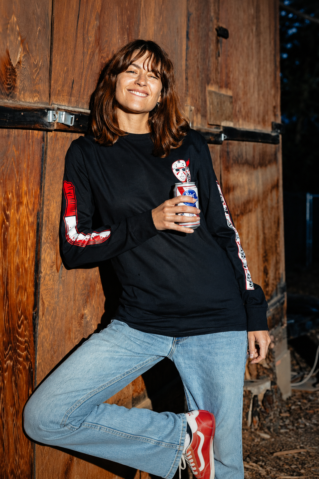
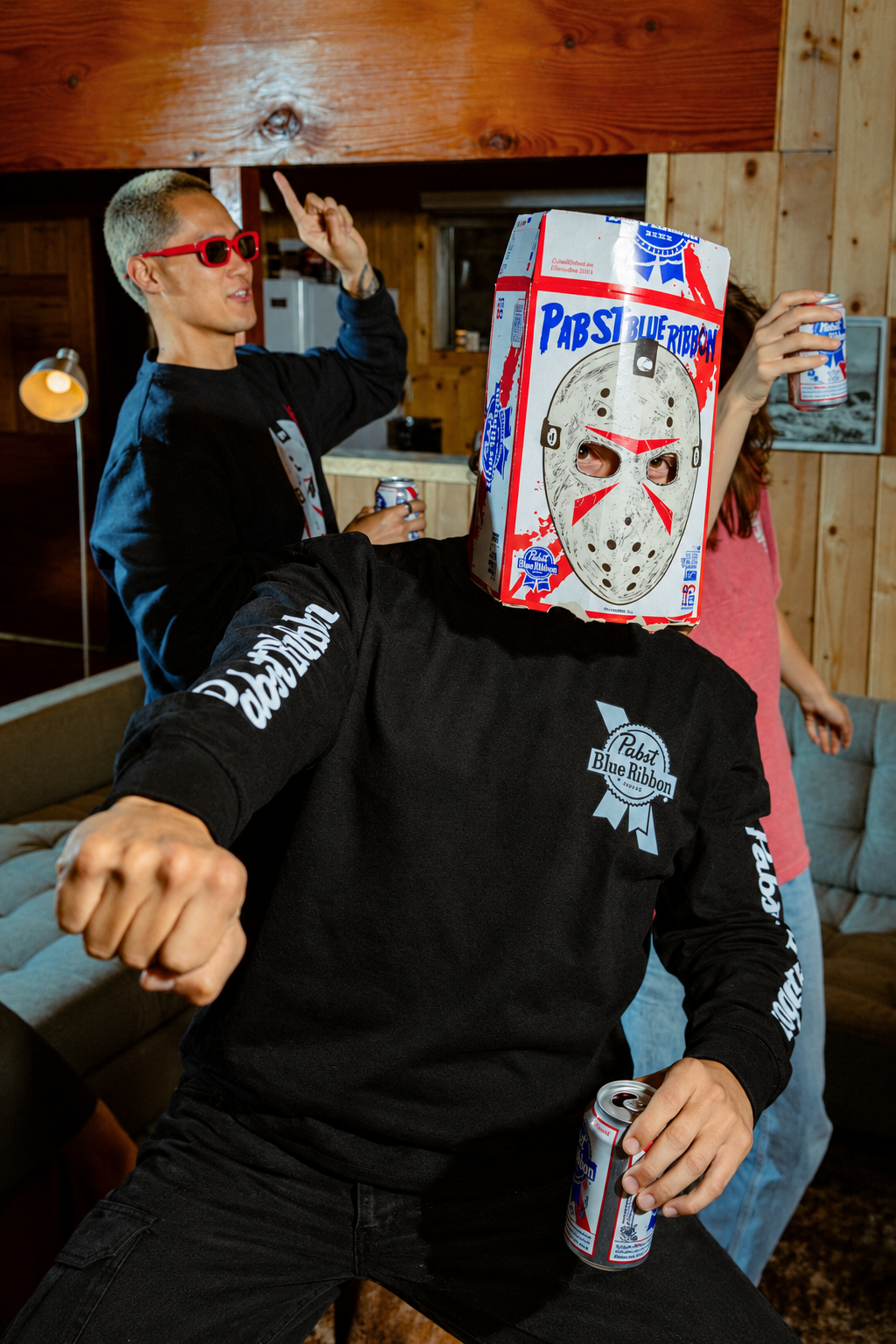
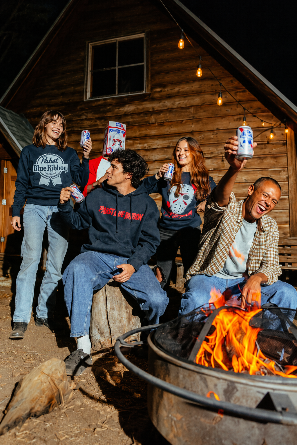
The assortment included T shirts, long sleeve shirts, crew neck sweatshirts, hooded sweatshirts, hats, a special hockey jersey, sticker packs, and additional items and accessories. Each category offered a different way to engage with the collaboration, from accessible everyday pieces to more distinctive statement products. The hockey jersey served as a natural centerpiece, connecting the sport’s visual language with Jason’s iconic hockey mask and giving the collection a strong focal point.
Halloween provided the creative backdrop and a meaningful occasion for the collection. The season’s connection to horror films, nostalgia, and self expression made it an ideal setting for bringing these two worlds together. The intention was to capture that energy through products that felt relevant to Halloween celebrations while retaining the appeal of apparel and collectibles people could enjoy beyond October.
A central part of the direction was finding the right balance between the two identities. The collection needed to feel immediately recognizable to fans of each brand while offering something distinctive through their combination. Across the assortment, the goal was to establish a shared visual language that could move between bold graphics, smaller branded details, and accessory applications without losing its character.
Working alongside strong design and production partners helped connect that creative direction to the finished product. The graphic design partnership shaped the collection’s visual expression, while the production team brought essential knowledge of materials, decoration, and execution. Together, we developed an assortment that considered both the impact of each individual item and the consistency of the line as a whole.
The resulting collection brought heritage branding, horror culture, and seasonal storytelling into a unified product offering. It reflects my approach to product design leadership: establishing a clear direction, building a thoughtful assortment, and collaborating with talented partners to turn a creative concept into a complete collection.
My Role
Director of Product Design / Graphic Design